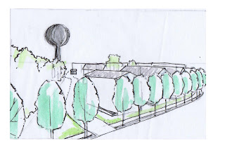
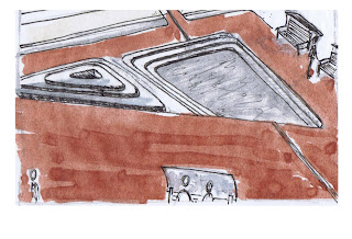
By doing these perspectives, I tried to capture the feeling of the place that I was aiming to create. I wanted to show what it would feel like to walk into the community. I wanted the drawings to be loosely sketched and not feel very mechanical. I added a little color to try and inject a little richness and depth. I think that I worked for most, but feel that some scenes would have worked better with less color or more muted tones.
 |
| Trees lining Whitfild Street |
 |
| Courtyard at eye-level |
 |
| Stormwater fountain and plaza offer community spaces |
 |
| Entrance to a mixed use building on the corner of Whitfield and Scales |
 |
| Example of housing |
 |
| A walk leading to plaza |
 |
| A birds-eye of the stormwater plaza |
 |
| Housing surrounding community garden and plaza |


No comments:
Post a Comment